When I find myself discussing what contemporary students are better or worse at than their forebears, one topic that crops up regularly is the ability to comprehend and manipulate numerical data – maths and stats related skills. It is a matter of deep regret to me that the curriculum across the UK Business School sector is becoming more and more a-numerate year on year as students [and staff!] become more innumerate. Foreign students regularly express their surprise at the low level of ability of even the very best UK students.
One of the ways this impacts on the teaching and learning of marketing related topics is the way in which you present and discuss data. Enter stage-left a new hero of mine. David McCandless describes himself as a data journalist and information designer. What that means is that he takes often complex and large sets of numerical data, and thinks of clever ways to present them in graphical form – so that they can be understood, comprehended and interpreted at an at least surface level.
You may have seen David’s work on a printed newspaper page or more likely on the equivalent website. One he did a while back was about the amount of oil being spilled in the gulf by BP in comparison to other oil leaks – that one went viral. Many of these representations are relevant to marketing activities, but let us just pick a couple of examples.
1. World Map of Touristyness: Map of Touristyness . This map takes file tags from a photo sharing site and compiles them with geographical co-ordinates to show where tourists go – or at least where they take their photos!
2. The colours used in products, packaging and advertising is very heavily culture dependent. This wheel compares and contrasts social/cultural perceptions of colours around the world: Colours in Cultures
3. There are a great many types/brand of carbonated beverage available. So how many companies actually manufacture and market them? It might be a fewer than you think: Soft Drinks - note the link at the bottom for zooming/exploring
4. Finally for now – places and people are different. Every country is the best/most prominent for something. Here is a not completely serious visualisation of that: Every Country is the Best at Something

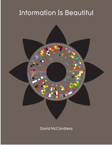
Seeing as David has so kindly presented us with these free toys, we should return the favour! He has a very interesting looking book, and I'm sure I'll pick up a copy sooner or later: Information is Beautiful
No comments:
Post a Comment
Comments are welcome - this isn't intended to be a formal place but please show consideration for others.